Built to make
complexity click.
Daltn connects the moving parts of a business. Its visual identity does the same: small units, clear structure and one memorable signal.
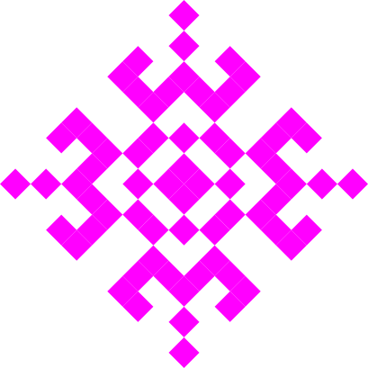
Many parts.
One clear system.
Daltn gives a business a connected memory, then makes that context useful for the next decision.
The identity takes its cue from that idea. Repeating pixel forms connect into a larger shape. Bright accents bring energy, while a quiet layout gives every message room to be understood.
A symbol made of
connected pieces.
Primary symbol / magenta Accent symbol / cyan
 Inverse symbol / whiteDaltn
Pair the supplied pixel symbol with the name Daltn. Keep the spelling exact: D-a-l-t-n. Set the brand name in Argent Pixel CF when the font is available. Use generous clear space around the symbol and avoid stretching, rotating or redrawing the master art.
The black, white, magenta and cyan assets are included in the download. Choose the version with strong contrast against its background.
Quiet canvas.
Electric signal.
The asset files define the core palette. Use white or black as the main field, then apply magenta and cyan deliberately to symbols, highlights and moments of interaction. Support text may use neutral grays for readability.
Human words.
Pixel character.
in motion.
Use for the name and select phrases. Its character is strongest when there is room to breathe.
what’s next.
Use for headlines, body copy, navigation and interface text. Keep sentences short and readable.
Argent Pixel CF is served through the supplied Adobe Fonts stylesheet. Use the licensed web font embed; the brand asset download contains artwork, not font files.
Built from
the same pieces.
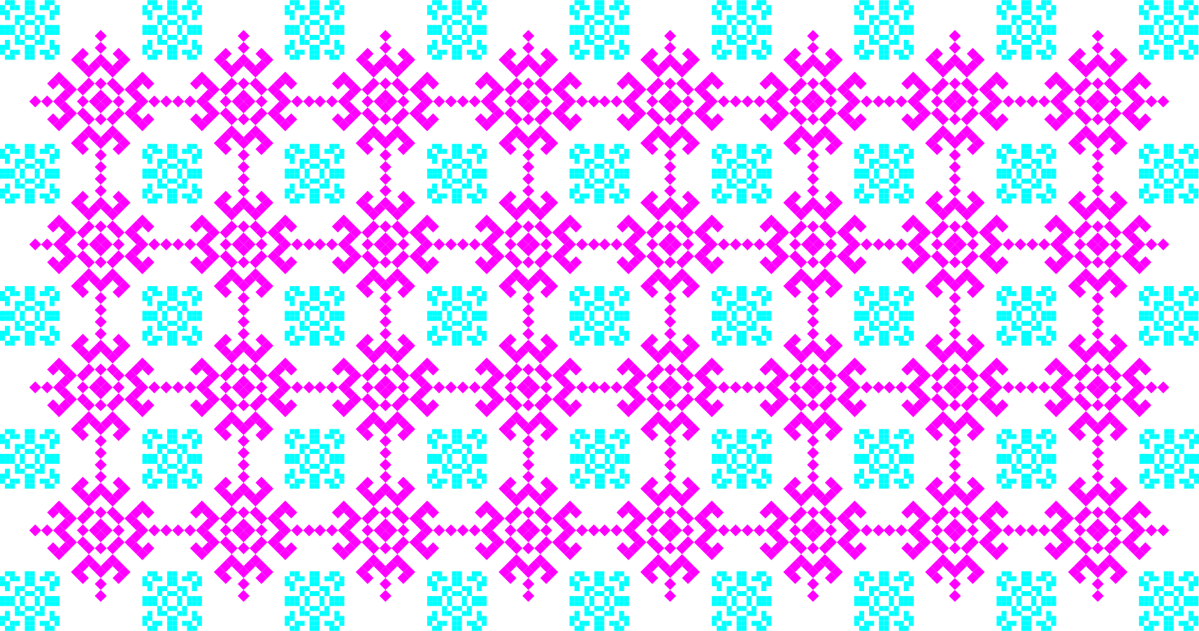 Combined / high energy
 Monochrome / structural
The anti motif belongs in patterns.
Use these inverse pixel forms as a repeat, texture or contained graphic. Keep the regular Daltn symbol for the brand signature.



Patterns work best as contained surfaces, crops or subtle textures. Keep product information and calls to action on clean fields so they stay easy to read.
Speak like someone
who gets the work.
Concrete before clever.
Name the customer, payment, project or decision. Show what Daltn connects before claiming that it is smart.
Clear before complete.
Lead with the point. Use one thought per sentence and let the interface reveal detail when it becomes useful.
Helpful, never presumptive.
Daltn asks when context is missing. Our writing should be equally careful about what is known and what is still being built.
Daltn runs the system.”
Make room for
the message.
DaltnOne connected picture.
Use white space, crisp rules and a small pixel signal.
DaltnEverything in place.
On dark fields, let cyan or white carry the identity.
These examples show the current digital direction. Preserve legible contrast, responsive spacing and the exact brand spelling in every application.
Take the pieces.
Keep them connected.
Get the supplied logo symbols and pixel patterns in their available SVG and PNG formats.
Download Daltn brand assets ↓